THE MOBILE JOURNEY

WHERE WE BEGAN
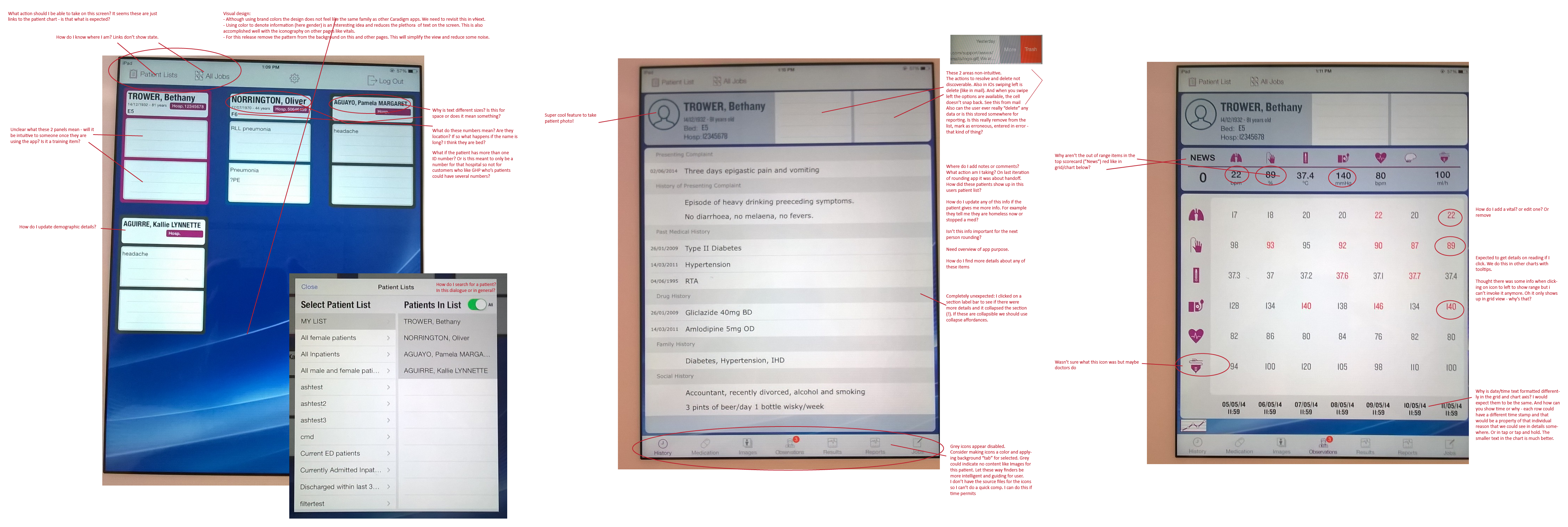
In late 2014 there was a rumor that Caradigm UK was creating a Mobile app for inpatient use in the UK. Sleuthing about I discovered that a demo had, in fact, been developed. This was intriguing. So I requested to take a look in my spare time which resulted in a quick Heuristic review. Although the app looked sparkly it didn’t work very well with overlapping gestures and some poor IA in places. Most disturbing was that it was not harnessing the much needed clinical data to make it relevant and compliant for hospital use. Upon seeing the results of my review I was given clearance to do an overhaul.

PHASE TWO
At the time we took on Mobile we were also looking at the global navigation patterns and design across all desktop apps. This included looking at our app brand colors in a new way. I took this direction and brought it to the Mobile work. This brought in the dark backgrounds and saturated blues you see below. Perhaps more importantly this phase of work was aimed at making the product usable both from an interaction and clinical data point of view. The missing data from the demo version complicated the UI needing more information packed into the limited real estate on a mobile device. The Mobile suite includes 3 separate apps that share screens so it had to be constructed to optimize for various personas. Besides the Home page, which allows users to quickly see their patient list and jump to an individuals chart, the Jobs page and Observations pages were key to our users, Doctors and Nurses.

MOBILE TODAY

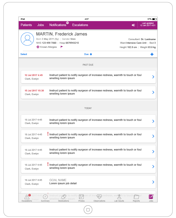
As Mobile matured we were able to focus on consistency and patterns
The data was bound and compliance was met.
New features were rolling in.
We were extending our dev team.
Our brand was evolving.
It was time for a style guide and CSS to make design and dev efficient and to ensure our users had a consistent experience.
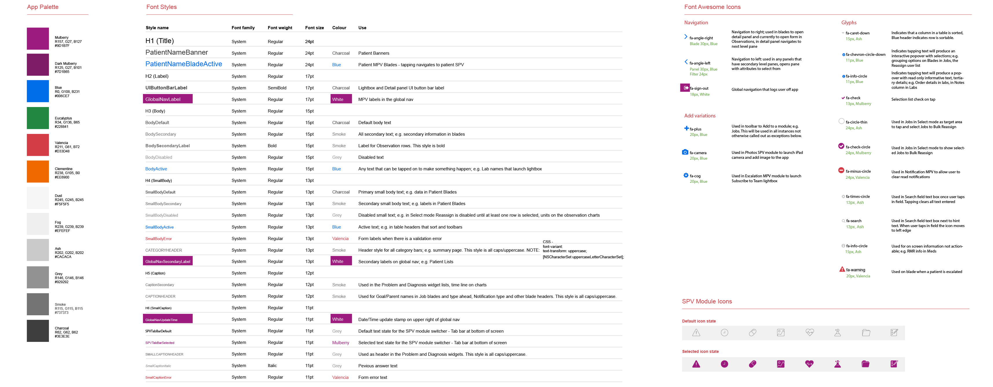
My goal was to reduce the colors, fonts, icons and patterns to the minimum number to support the needs of our users.
Working with Jesse Brown, I created a color guide that reduced the number of colors to align with both Caradigm brand and iOS native palette.
I created a Font sheet that was converted to CSS for iOS by our UI dev Neil Shetty.
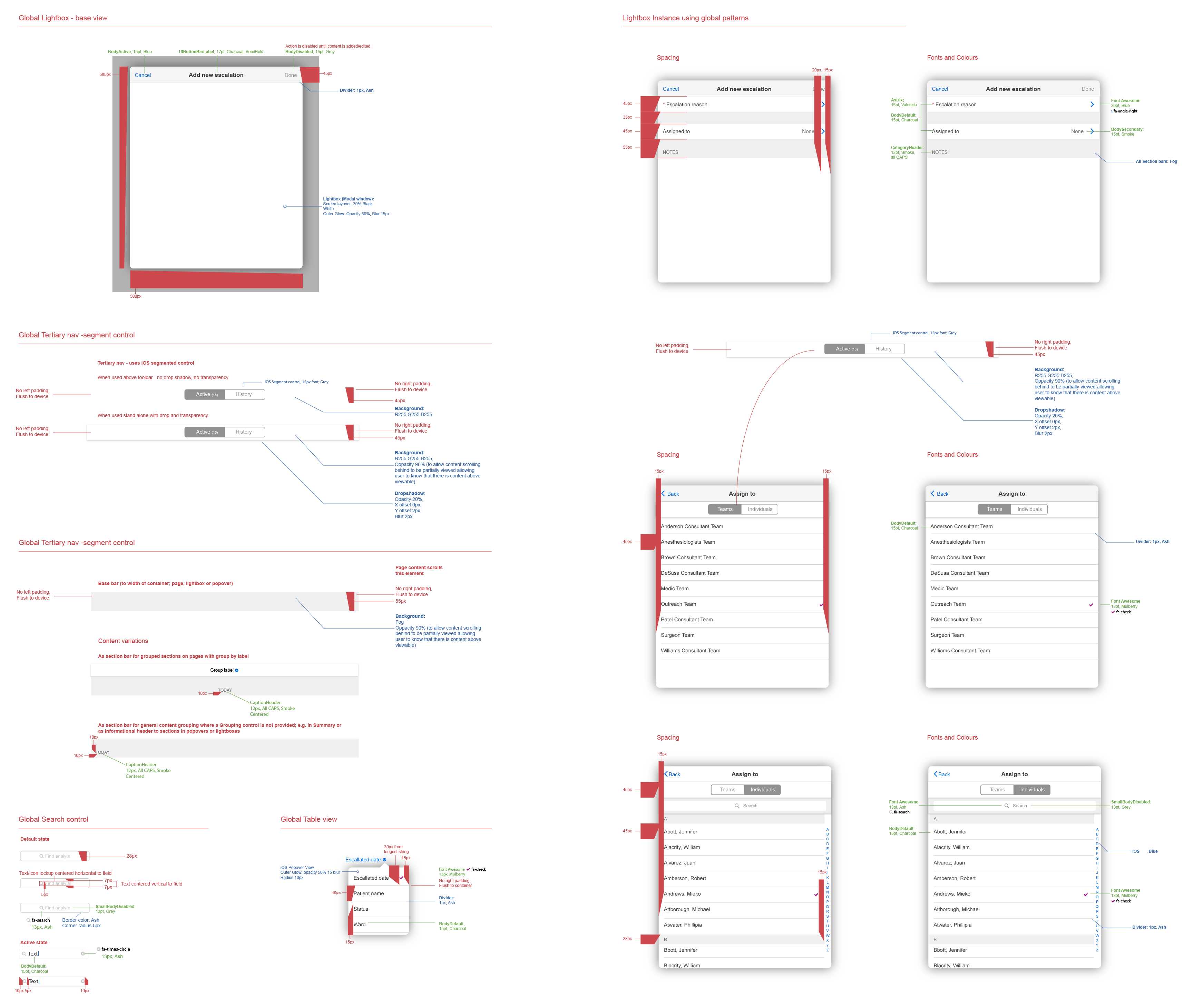
Using OneNote as our style guide container I designed each component used in the Mobile space and provided in depth redlines for all developers and designers to follow.
The result was a clean, modern design that enables our clinical users to care for their very important patients.

